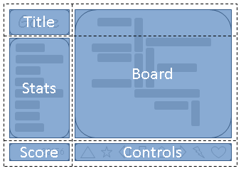
Grid-template-areas

Grid Exampule 1

Game Title

Score

Stats

Board

Abstract

This CSS module defines a two-dimensional grid-based layout system, optimized
for user interface design. In the grid layout model, the children of a grid container
can be positioned into arbitrary slots in a predefined flexible or fixed-size layout grid.

The rows, columns and areas of the grid are defined visually using
the is a row, grid-template-areas property. Each string
and each word an area. The number of words in a
determines the number of columns. Note the number of words
string in each string must be identical.

The way to size columns and rows can be assigned with the
grid-template-columns and grid-template-rows properties.

Controls

next Grid Exanpule 2.html

  #grid {
      display: grid;
      grid-template-areas:
               "maintitle  maintitle"
               "title      title"
               "stats      board"
               "score      ctrls";  
      grid-template-columns: auto 1fr;
      grid-template-rows: auto auto auto 1fr auto;
  }
  
  #maintitle {
    grid-area: maintitle;
  }
  #title    {
    grid-area: title;
    background-color: rgba(255,0,0,0.5);
  }
  #score    {
    grid-area: score;
    background-color: rgba(53,151,149,0.5);
   }
  #stats    {
    grid-area: stats;
    background-color: rgba(2,253,102,.5);
   }
  #board    {
    grid-area: board;
    justify-self: start;
    align-self: start;
    background-color: rgba(255,204,0,.5);
      }
  #controls {
    grid-area: ctrls;
    background-color: rgba(153,51,204,0.5);
   }